
As I am sure you all have noticed… I have been busy working on a new design for iHeartPublix!
It’s hard to believe, but I started this site way back in 2009. There have been many different versions over the years and I try to keep it fresh and up to date. BUT, in doing that, I know that some folks are going to be thrilled and love the changes while some will not.
I get it, I am a creature of habit. So I understand that change can be hard and it takes time to get into a new routine. But with the server issues, I thought this would be the ideal time to make some changes. Oh and about the server issues… it’s a very long story, but the datacenter that stores my data is dealing with a ransomware attack. So, I am stuck in the middle STILL waiting for them to release my data. I am hoping to get everything back ASAP and it will be seamlessly added back into this new design.
Ok, back to the news about this shiny new website!
I have tried my best to make it as user-friendly as possible. The biggest difference that you will see is that you now come in to a new landing page. This landing page is where you will navigate to all the different areas of the site. Now, I know the biggest need is to see all the deals and view the weekly ads.
I have tried to make that super simple by placing the links in several places on the landing page. First, the navigation bar is the fastest way to jump from page to page. You’ll notice that the navigation bar stays right at the top of your page even when you scroll. So if you are at the bottom of any page and want to jump to another page, it’s a simple mouse click to get to where you need to be.
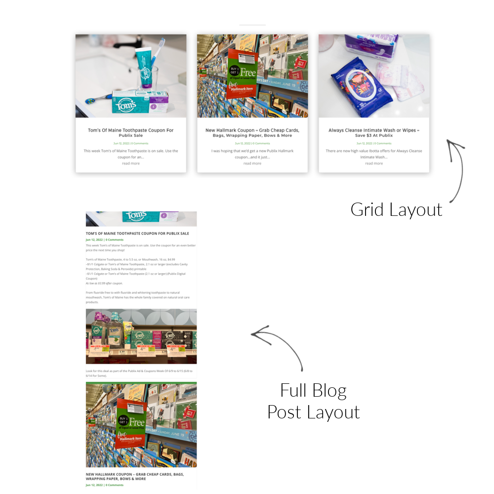
Now, the biggest thing I am struggling with is how to get the deals delivered in an easy-to-read and convenient format. PERSONALLY, I prefer a grid layout instead of the expanded full blog layout.
The grid format gives you a snippet of the post that you then have to click to open and read. It allows you to scan and then click to open only the posts that appeal to you. There is no need to endlessly scroll and look for deals that you like.
The grid format also allows the reader to “open” the post to see the full range of content in each post- including some that can not be viewed in the full blog layout.
Now, the full blog layout has some benefits. For folks who want to see everything at once without having to click, the blog layout is definitely beneficial. You can just scroll to your heart’s content with minimal mouse clicks. Obviously some clicking is needed as those full layout pages can get pretty long. I believe I have the current version set to see 8 posts per page.
But, as I mentioned, that full layout option does have some drawbacks. The main one for me is the shopping list feature. In order to “activate” the shopping list feature, you have to view the deal as a single post. So you would have to click anyway to open the post and then add the deal to your shopping list. That kinda defeats the whole need for the long format.
It’s also a little bit harder to see separation in the deals. The deals kinda run together with all that scrolling. I am trying to come up with a way to help that a bit… but, since the full layout is really just a curated feed of all the posts on one page.
I am still working on things and it may take me some time to get the FINAL version complete. I have a lot of things that I would like to do, but limited time to make all of it happen. I would love some feedback from you as I am working on everything.
First, I’d love for you to take a minute and let me know how you prefer to view the deals. Are you TEAM GRID or TEAM FULL BLOG LAYOUT?
If you have any additional feedback, see any issues that I might have missed or just want to chat feel free to leave a comment or email me directly. I can only look at things from my perspective so fresh eyes can be a good thing. Maybe you have a tip or suggestion that will add more functionality or a better user experience. I am 100% open to hearing ideas!
Obviously I want you all to love the site and I am excited for some of the new features that I will be introducing soon. I hope it continues to be a benefit to you all. I think we can agree that saving money is so important, perhaps now more than ever!


Weekly ad not listed under the Publix Ad & Flyers.
Assuming that Publix Ad = Weekly Ad
What’s the deal with username and email showing up all caps below?
LOVE the grid layout. I would prefer to see “All Post” in grid format as well, and then click on what I to see more details about (similar to the previous layout). For me the new layout seems a lot more scrolling to get to the next item/post/page especially if it’s a longer post or the weekly ad. THANK YOU FOR ALL THE HARD WORK AND ASSISTANCE YOU PROVIDE!!!
Amen to that. Grid layout please. It’s very inconvenient to view when I use it on my phone while shopping. Sometimes, I just want to take a quick look to see if there is any new deal that I want to grab since I’m already in the store. I don’t want to have to scroll through a full page, then next page just to find a quick deal. Thanks for the work. I check this website very regularly (almost everyday).
Lookin’ good!! 😉
It is very eye catching but the font appears to be a gray color that is kind of hard to read on the green background in the weekly ad and even difficult for some of us with vision problems to see on white background.
Hi Michelle –
AWESOME job on the new lay-out 🙂
Personally, I only have one comment if it’s OK. For the frequent visitors, the POP up when you access the site about signing up for email notification may get a little annoying. (I was surprised when I first saw it). If possible, could it be altered and perhaps be posted elsewhere in lieu of the POP-up? Just a thought.
Thank you for all you do for us ❤
The pop up should only come up once… well, once per device and then not again once you dismiss it.
I really just put it up to let people know I am still working on the site. I will remove it once I get everything done… but I still have a few areas under construction 🙂
Ahhhhhhhh……I think it must be because I have my browser set to “never remember my history” and when I exit it and come back in later, once I pull up the site the POP-up comes up again.
Thanks for letting us offer up suggestions 🙂
Have a FANTABULOUS DAY !!!
Oh well I would have never thought of that– hahaha!
I had everyone I know test it to make sure it wasn’t going to be annoying and keep popping up.
I never thought about that history setting. Hopefully I can get things resolved soon and it will be a non-issue!
Featured deals. The same 4 stay at the top of this page. I don’t like it! 🙂
I want to go to a page & see the most current deal at the top, please.
Have you discontinued the digest version that used to be sent out as an e-mail to people who signed up for it? This used to include some 10-12 deals whenever that threshold was reached. Most days I only received one e-mail digest, sometimes 2. I am still getting the e-mails that involve one promotional ad for a certain product.
Working on that now—hope to have things back up and running ASAP 🙂